When you land in Free Fire, your name is the first thing other players see. A distinct font style turns a plain username into a signature that sticks in the kill feed and makes you memorable before the first shot is fired. The difference between a default name and a styled one is immediate: you go from anonymous to recognizable. But what actually counts as a font style in Free Fire isn't what most players assume.
Why Your Free Fire Name Needs a Distinct Look

In Free Fire, your in-game name is your personal brand. It appears in kill feeds, squad lists, and end-of-match screens, so a unique font style helps you stand out in a lobby full of generic names. When you switch from a plain name to one with a bold, decorated font style, your squadmates start recognizing you instantly, and random players begin commenting on the name before the match even starts. That visibility isn't just cosmetic; it builds a reputation that follows you across servers.
A distinct font style also makes your name easier to spot in chaotic kill feeds. During intense firefights, the feed scrolls fast, and a styled name with symbols or a heavier typeface catches the eye more reliably than default text. This is especially useful for content creators and clan leaders who want their names to be instantly associated with their gameplay. Whether you're going for a clean, modern look or an aggressive, tattoo-inspired aesthetic, the right font style communicates your playstyle before you ever say a word.
Finally, a unique font style helps you avoid name collisions. Free Fire has millions of players, and popular names are often taken. By applying a custom font style, you can keep the core name you love while making it visually distinct from every other player using the same base text. This is where tools like ff font style generators come in, giving you access to hundreds of Unicode variations that work directly in the game without any downloads or registration.
Key Takeaways
- Your Free Fire name is your first impression in the lobby and kill feed, so a distinctive font style helps you stand out instantly.
- Font styles in Free Fire are created with Unicode symbols, fancy letters, and decorative characters, not by changing the game's actual font files.
- Namesforfreefire.com lets you mix font names and styles, symbols, and decorations, then copy the finished name into the game with one tap.
- Readability still matters: a font style that looks cool but is hard to read in a fast kill feed can hurt your recognition.
What Font Styles Actually Are in Free Fire
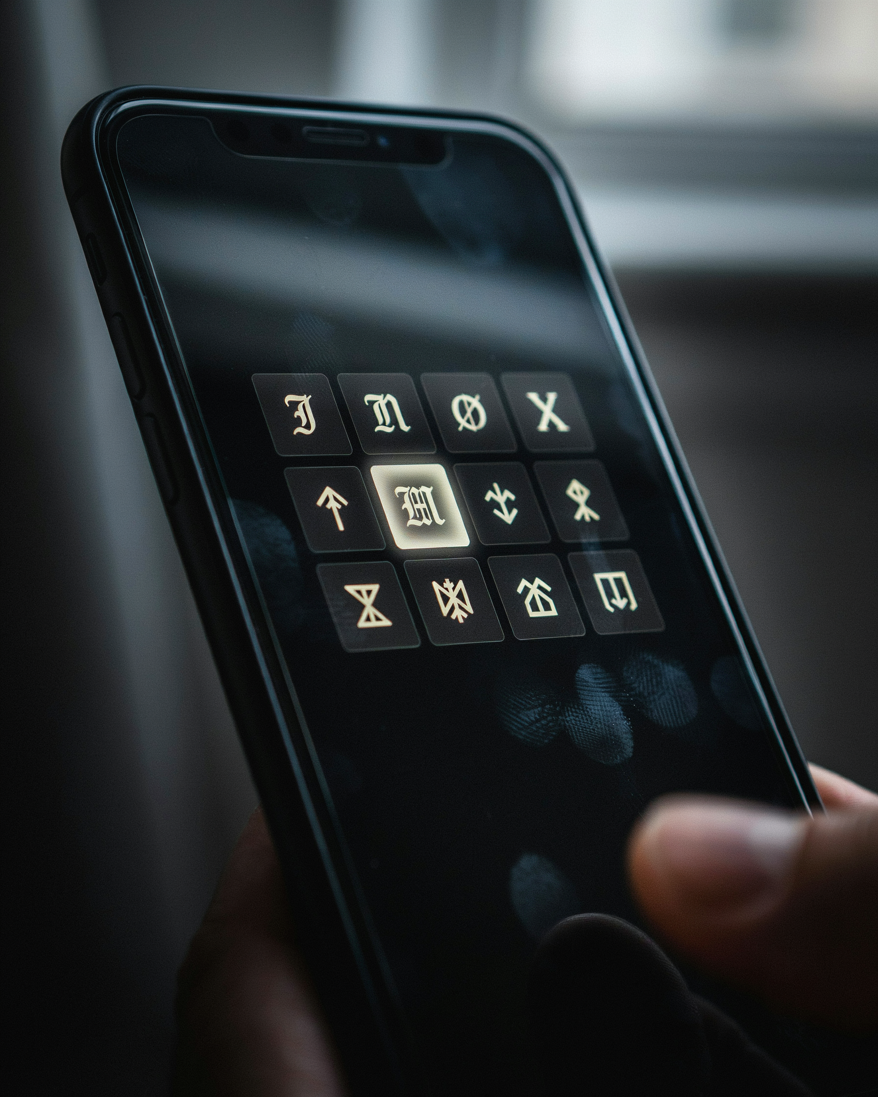
When we talk about font styles in Free Fire, we're not changing the game's core typography. Free Fire uses a fixed system font for its interface, kill feeds, and player names. What players call ff font style is actually a layer of Unicode symbols and special characters that sit alongside your letters, making your name look like it's using a completely different typeface.
There are three layers to understand. First, the system font is what the game engine renders by default. You can't change it through any in-game setting. Second, Unicode symbols like crowns, stars, and arrows can be pasted into your name field because Free Fire accepts most Unicode characters. These symbols visually alter the spacing and weight of your name, which is why a name like 『CROWN』RAVEN looks so different from plain RAVEN. Third, fancy text generators take standard letters and map them to Unicode look-alikes, such as mathematical bold or script characters. The result is a name that appears to use a custom font, but it's really just a clever substitution of characters.
This distinction matters because not every device renders Unicode the same way. A font ff style that looks sharp on an Android phone might show as empty boxes on an older iPhone. That's why we always recommend testing your name in a custom room before locking it in. The safest approach is to stick with widely supported symbols and avoid obscure Unicode blocks that only a few fonts include.
So when someone asks how to get a different font in Free Fire, the honest answer is: you don't change the font, you change the characters. That's the core idea behind every simbol mahkota font trick you see on YouTube. Once you understand this, choosing the right style becomes a matter of taste, not technical skill. For a deeper look at how Unicode works across platforms, the Unicode Consortium's FAQ is a solid reference.
Font Names and Styles: The Vocabulary You Need
When players talk about font names and styles, they usually mean the visual categories a typeface falls into. In Free Fire, the game's built-in name system only accepts plain text, so every fancy look comes from Unicode characters that mimic these categories. Knowing the vocabulary helps you describe what you want and pick the right generator output.
Serif fonts have small decorative strokes at the ends of letters. They feel classic and slightly formal, which can make a name look like it belongs on a guild banner. Sans-serif fonts drop those strokes for a cleaner, more modern look. Most of the readable stylish names you see in kill feeds lean on sans-serif Unicode blocks because they stay legible at small sizes.
Script fonts imitate handwriting or calligraphy. They're popular for romantic or elegant names, but they can be hard to read mid-match. Decorative fonts are the wild cards: bubble letters, gothic blackletter, and symbol-heavy styles that add personality. A decorative style works best when you keep the rest of the name short.
On ff font style tools, these categories are usually grouped by vibe rather than technical name. You might see tabs like "cool," "cute," or "scary" instead of "serif" or "script." That's fine for browsing, but knowing the real terms lets you search more precisely and explain to friends why one name looks sharp while another looks messy.
How to Choose a Look That Fits Your Playstyle
Your Free Fire name is the first thing enemies see in the kill feed, and the right font style tells them exactly who they're dealing with before the first shot is fired. Start by asking what kind of player you want to be in that match. An aggressive rusher benefits from bold, heavy fonts with sharp angles, while a stealthy sniper might prefer thin, almost invisible lettering that blends into the background. The font style you pick isn't just decoration, it's a psychological signal.
For aggressive players, look for blocky or italicized fonts that feel fast and loud. These styles mirror the way you push fights and take space. Pair them with symbols like lightning bolts or skulls to reinforce the message. Stealthy players should choose minimal, lowercase fonts with no extra flourishes. The goal is to be forgettable in the lobby but terrifying in the final circle. Funny or casual players can lean into rounded, bubbly fonts that make teammates laugh before the drop. Esports-focused players often stick with clean, highly readable fonts because sponsors and tournament overlays need clarity above all else.
One practical trick is to test the name in different sizes. A font style that looks amazing on a phone screen might become unreadable when your name flashes across a kill feed at 40 pixels. Also avoid fonts that rely too heavily on Unicode symbols, because some devices render them as blank boxes. The best font style is the one that stays legible while still matching your persona. When you build names on Namesforfreefire.com, preview each style next to a sample kill message before committing. That extra step saves you from embarrassing unreadable tags more than once.
Remember that your font style can change with your mood or the mode you're playing. Keep three or four saved styles ready, one for ranked grind, one for casual squads, and one for trolling friends. The flexibility keeps the game fresh and lets you adapt to whatever lobby you land in.
Combining Fonts and Symbols
Once you've picked a base font, the real fun starts when you layer symbols and decorations over it. You're styling the font itself, not just changing the letters. Start with a clean base like a bold serif or a sharp gothic font, then add one or two Unicode symbols that match your vibe. A crown above the first letter signals royalty, while a skull at the end adds menace. The key is restraint: one symbol per name reads clearly in the kill feed, but three or four symbols turn your name into visual noise that other players skip over.
Think of it as building a sandwich. The base font is the bread, the symbol is the filling, and the spacing or underline is the sauce. For example, take the name "RAVEN" in a standard font, then wrap it with a crown symbol on top and a small flame at the end. Instantly it becomes a name that stands out in the lobby without being unreadable. You can also combine two different font styles within the same name, like a fancy script for the first letter and a clean sans-serif for the rest. That contrast draws the eye exactly where you want it.
When you use a tool like ff font style, you can preview these combinations in real time. The generator shows you how a crown from the simbol mahkota font library looks over different base fonts, so you can experiment without typing a single character manually. Just copy the finished name and paste it directly into Free Fire. Names with one well-chosen symbol get more friend requests than names with five random decorations, because they still look intentional and clean.
The Difference Between Fonts and Text Decorations
When we talk about fonts style in Free Fire, we're not actually changing the font file the game uses. The game engine renders every player name with the same default typeface. What changes is the set of Unicode characters we swap in, characters that look like decorated letters but are technically different code points. A regular "A" and a bold script "𝘈" are not the same character to the system, even though your eye reads them as the same letter.
This matters because it explains why some names display perfectly on one device and break on another. True font files would render consistently everywhere. Unicode glyphs depend on the device's font library. If a phone lacks a glyph for a specific symbol, the name shows a blank box or a fallback character. That's why font ff tools always preview the name before you copy it, so you can catch unsupported characters early.
Text decorations are the second layer. These are the symbols around the letters: crowns, wings, stars, and lines. They don't change the letterforms at all, but they change how the name feels. A name with a single crown reads as royal. A name wrapped in flames reads as aggressive. The best names combine a readable base font with one or two decorations, never ten. Too many decorations turn the name into visual noise, and the kill feed becomes a blur. So when someone says fonts style, they really mean the whole package: the Unicode letterforms plus the decorative symbols that frame them.
Tattoo Font Styles for Edgy Gaming Names
Tattoo font styles bring a raw, hand-drawn energy to your Free Fire name that clean sans-serifs just can't match. We're talking about lettering that looks like it was inked onto skin: heavy blackwork, sharp serifs, and flourishes that curl like smoke. When you see a name like 𝕯𝖊𝖆𝖙𝖍𝖘𝖙𝖗𝖔𝖐𝖊 in the kill feed, you know that player has put thought into their identity. The most common tattoo font styles fall into three camps: gothic, script, and tribal-inspired.
Gothic lettering, sometimes called blackletter, uses thick vertical strokes and angular corners. It reads as aggressive and medieval, perfect for names like 𝕽𝖊𝖖𝖚𝖎𝖊𝖒 or 𝕭𝖑𝖆𝖈𝖐𝕾𝖆𝖇𝖇𝖆𝖙𝖍. Script tattoo fonts mimic cursive handwriting with flowing loops and connected letters, giving a name like 𝓢𝓱𝓪𝓭𝓸𝔀𝓑𝓵𝓪𝓭𝓮 a dangerous elegance. Tribal-inspired styles borrow from traditional tattoo motifs with sharp spikes and geometric cuts, ideal for short, punchy names like 𝕯𝖆𝖌𝖌𝖊𝖗 or 𝕾𝖆𝖛𝖆𝖌𝖊.
One thing to remember: readability drops fast when you stack too many decorative elements. A gothic font with added crown symbols becomes a visual mess in the kill feed. The sweet spot is one tattoo font style plus maybe one small symbol, like a dagger or flame. If you want to see how these look in real time, the ff font style generator lets you preview gothic and script options instantly. For players who want a crown accent on top of their tattoo lettering, the simbol mahkota font collection pairs surprisingly well with blackletter styles.
There's also a dedicated font ff page where you can mix tattoo-style fonts with other decorations without breaking the character limit. The key is restraint: pick one tattoo font style, commit to it, and let the name itself carry the intimidation.
Step-by-Step: Creating Your Name with Namesforfreefire.com
Namesforfreefire.com removes the guesswork when you build a new Free Fire name. The workflow is simple: type a base name, browse the font styles, add symbols, and copy the result. Here's exactly how it works.
- Type your base name. Open the tool and enter the name you want to style. Start with something short and punchy, like "Rex" or "Nova," because longer names get harder to read once symbols are added.
- Browse the font styles. The site shows dozens of ff font style options, from bold block letters to cursive scripts. Scroll through and tap a few that match your playstyle, whether that's aggressive or playful.
- Add symbols and decorations. After picking a font, layer in crowns, flames, or other simbol mahkota font elements. The key is restraint: one or two symbols make a name pop, but five make it unreadable.
- Copy the result. Namesforfreefire.com gives you a one-tap copy button. Paste the styled name directly into Free Fire's name-change field and confirm it fits the character limit.
One thing to learn early: test the name in a private match before committing. Some fonts look great in the tool but blur in the kill feed. Keep a backup list of three or four font ff variations so you can switch if a name gets reported or feels stale. The whole process takes under two minutes once you know what you want. You can also check the symbols page for a wider set of decorations that work with your chosen font style.
Common Mistakes That Ruin a Name
Plenty of players wreck a perfectly good name by chasing the flashiest glyphs they can find. The most common error is picking characters that look cool on a generator but turn into empty boxes or question marks inside the game client. Free Fire only renders a specific set of Unicode symbols, so that fancy heart or lightning bolt you copied from a random site may not survive the login screen. Stick to the symbol sets that Namesforfreefire.com already tests against the game, and preview your name in a kill feed before you commit.
Over-decoration is the second trap. When every letter carries a crown, a wing, and a shadow, the name stops being readable and starts looking like visual noise. Choose one decorative element per name, maybe two if they're short, and let the base font carry the rest. A clean name with a single well placed symbol reads faster in the heat of a match, and that matters more than showing off every Unicode trick you know.
Banned characters are the silent killer. Free Fire blocks certain symbols and even some full width letters, especially ones that mimic official tags or break the profanity filter. If your name gets rejected, don't just add more symbols to force it through. Swap the offending glyph for a visually similar but allowed one, or simplify the style entirely. A name that actually loads is always better than a name that looks perfect in a screenshot but never appears in game.
How Font Styles Affect Readability in Kill Feeds
Many players pick a ff font style that looks incredible in the preview, only to squint at their own name in the kill feed during a ranked match. The problem is simple: Free Fire renders player names at a tiny size, often under 14 pixels tall on a phone screen. Fancy Unicode characters that rely on thin strokes, heavy outlines, or stacked diacritics collapse into visual noise at that scale.
Take the popular font ff styles built from fullwidth characters. They read fine in a 40-pixel preview, but in the kill feed they blur together, especially on low-end devices where anti-aliasing is weak. The same goes for styles that mix multiple scripts, like combining Latin letters with simbol mahkota font decorations. A crown above every letter might look regal in a screenshot, but in motion it turns your name into a smear of pixels.
A good rule of thumb: test any font style in a real match, not just the generator. If you can't read your own name at arm's length within half a second, your squad can't either. Stick to styles with clear letterforms, moderate spacing, and no more than one decorative layer. Readability wins fights; a name nobody can read is just noise.
Frequently Asked Questions
What are the best font styles for a Free Fire name?
Bold, outlined, and cursive fonts work best because they stay readable in kill feeds. Lean toward styles with clean strokes, like black-letter or sharp serif, and avoid overly thin scripts that blur on small screens.
Can I use symbols with font styles in my Free Fire name?
Yes, combining a simbol mahkota font with a strong typeface adds personality. Keep symbols to one or two per name so the font style remains the star and the name doesn't look cluttered.
Do font styles affect how my name appears in the game?
Free Fire renders most Unicode font styles correctly in lobbies and kill feeds, but some decorative characters may show as boxes on older devices. Test every style on a mid-range phone before recommending it.
How do I copy a font style from Namesforfreefire.com?
Type your base name, pick a style from the preview grid, then tap the copy button next to it. Paste it directly into Free Fire's name-change field. No registration is needed, and the tool works on both mobile and desktop.
Why does my font style look different after I paste it?
Some apps strip Unicode formatting when you paste. Paste into a plain-text note first, then copy from there into Free Fire. If a character still breaks, swap it for a similar glyph from the same font family.